June 2021 – An in-depth look at income inequality in Hillsborough County “The extent of and continuing increase in inequality in the United States greatly concerns me.” – Janet Yellen, Secretary of the Treasury[i]
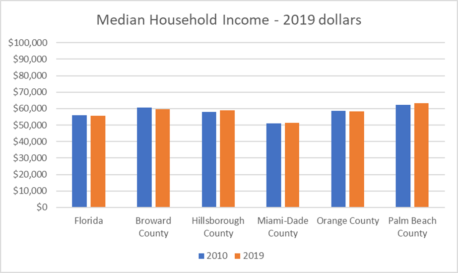
Despite tremendous growth in the county’s Gross Domestic Product (GDP) in the last 10 years (29%)[ii], household median income in Hillsborough County and Palm Beach County barely budged[iii]. It remained unchanged or declined slightly in Broward, Miami-Dade, Orange Counties, and Florida (See Figure 1). Thus, in relation to 2010, the additional wealth created did not translate into substantially more income for the average household.
Figure 1. Median Household Income in 2010 and 2019
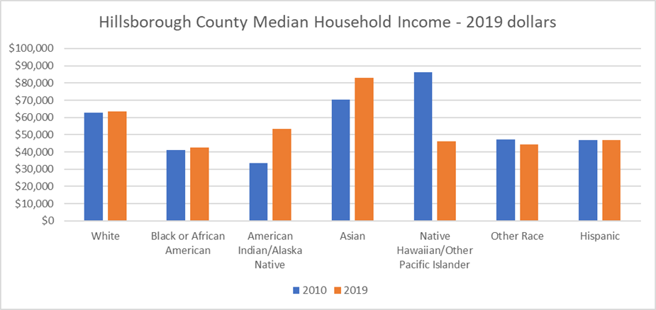
When the household income data is broken down by race and ethnicity, there are persistent trends and gaps (See Figure 2). Since the Hillsborough Median Household Income grew almost imperceptibly, it is not surprising that median household income for the largest racial and ethnic groups (i.e., Blacks, Whites, and Hispanics) stayed the same or declined in relation to 2010. Moreover, like in 2010, the 2019 median income for White households is 52% higher than Black households and 33% higher than Hispanic households. Black households reported the lowest median household income in 2010 and 2019. Figure 2 also shows some dramatic fluctuations for other racial groups (e.g., Native Hawaiians). Since these groups are a very small share of the county’s population, household income may be based on very small samples. Hence, the surveyed median income data is less reliable.
Figure 2. Hillsborough County’s Median Household Income by Race/Ethnicity
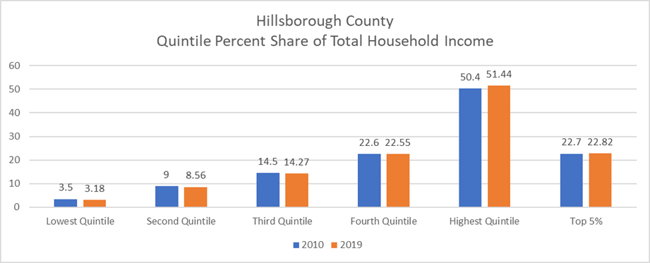
To understand how income is distributed, households are divided into quintiles. A quintile represents 20% of households. The lowest quintile (bottom 20%) may earn up to $25,000. Households in the highest quintile (top 20%) earn at least $229,000[iv]. In Hillsborough County, 2019 income distribution ranged from 3.18% for the lowest quintile (bottom 20% of households) to 51.44% for the highest quintile (top 20% of households) [v]. As seen in Figure 3, only highest quintile increased their share of aggregate income since 2010. The highest quintile’s share of aggregate income exceeded 50% in Florida and the four other largest counties. Thus, despite the impressive growth in real GDP, inequality increased significantly in relation to 2010. This is a persistent nationwide trend.
Figure 3. Quintile Percent Share of Total Household Income
Although inequality is endemic to capitalism, there are costs associated with increasing income inequality. Amongst many things, higher income inequality reduces consumption and lowers economic growth. The reason is that poorer households are prone to consume (rather than save) a higher share of their income. According to the Penn Wharton Budget Model[vi], the lowest quintile household spent 55 cents of every new dollar that they earn. In contrast, the highest quintile only spends 12 cents of every new dollar they earn. For example, if the share of aggregate income would have remained the same as in 2010, net additional annual consumption expenditures would have ranged from $120 million (Hillsborough County) to $200 million (Orange County) (See Table 1). Statewide, net additional annual consumption expenditures were estimated at $1.58 billion. Moreover, if through public and private initiatives, the four lower quintiles would have increased their share of aggregate income by 1%, net consumption in Hillsborough County would have been $480 million dollars higher. Statewide, net consumption would have been nearly $7 billion dollars higher.
Table 1. Additional Consumption by Quintile (billions of 2019 dollars) assuming 2010 income shares
| Geographic Area Name | Lowest Quintile | Second Quintile | Third Quintile | Forth Quintile | Highest Quintile | Net Total New Consumption |
| Florida | $0.82 | $1.04 | $0.56 | $0.25 | -$1.10 | $1.58 |
| Broward County | $0.08 | $0.07 | $0.08 | $0.05 | -$0.13 | $0.15 |
| Hillsborough County | $0.08 | $0.08 | $0.02 | $0.00 | -$0.05 | $0.12 |
| Miami-Dade County | $0.09 | $0.11 | $0.08 | $0.05 | -$0.16 | $0.18 |
| Orange County | $0.11 | $0.11 | $0.07 | $0.03 | -$0.12 | $0.20 |
| Palm Beach County | $0.09 | $0.11 | $0.05 | $0.02 | -$0.10 | $0.17 |
As we have seen, median income has stagnated. African Americans continue to report the lowest median household income. Alas, income inequality has increased everywhere. Aside from the human costs, rising income inequality is constraining our ability to reach even higher levels of economic growth.
![]()
[i] Yellen, Janet. Remarks. Perspectives on Inequality and Opportunity from the Survey of Consumer Finances. At the Conference on Economic Opportunity and Inequality, Federal Reserve Bank of Boston, Boston, Massachusetts. October 17, 2014. Link: https://www.federalreserve.gov/newsevents/speech/yellen20141017a.htm.
[ii] Bureau of Economic Analysis’ Local Area Gross Domestic Product estimates. Link: https://www.bea.gov/data/gdp/gdp-county-metro-and-other-areas
[iii] Median Income in The Past 12 Months (In 2019 Inflation-Adjusted Dollars). Survey/Program: American Community Survey. Year: 2019. Estimates: 5-Year. Table ID: S1903
[iv] Household Income Quintile Upper Limits. Survey/Program: American Community Survey. Universe: Households. Year: 2019. Estimates: 5-Year. Table ID: B19080
[v] Shares of Aggregate Household Income by Quintile. Survey/Program: American Community Survey. Universe: Households. Year: 2019. Estimates: 5-Year. Table ID: B19082.
[vi] Dinerstein, Marcos, et al. Background: Marginal Propensities to Consume in the 2021 Economy. Penn Warton Budget Model. University of Pennsylvania. Published February 3, 2021. Page 15. Link: https://budgetmodel.wharton.upenn.edu/issues/2021/2/3/background-mpc-in-2021-economy